SpeechUI for Angular
An UI kit with all the essentials upgraded to work with speech
Setup
Requires Angular 20–22.
npm install @listenssoft/speechui-angularAdd provideListens
Angular has no provider component. Register the kit with provideListens in app.config.ts, which your main.ts already passes to bootstrapApplication. Pass your license key as licenseKey. Get your license key.
app.config.ts
import { ApplicationConfig } from '@angular/core';
import { provideListens } from '@listenssoft/speechui-angular';

export const appConfig: ApplicationConfig = {
  providers: [provideListens({ licenseKey: 'YOUR_LICENSE_KEY' })],
};Then put listensRoot on your root component’s outer element (app.ts, or app.component.ts in projects created before Angular 20). That element is the press-and-hold-to-talk surface.
app.ts
import { Component } from '@angular/core';
import { RouterOutlet } from '@angular/router';
import { ListensRootDirective } from '@listenssoft/speechui-angular';

@Component({
  selector: 'app-root',
  imports: [RouterOutlet, ListensRootDirective],
  template: `
    <div listensRoot>
      <router-outlet />
    </div>
  `,
})
export class App {}Add a listening bar or popup
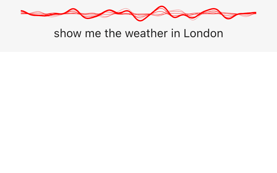
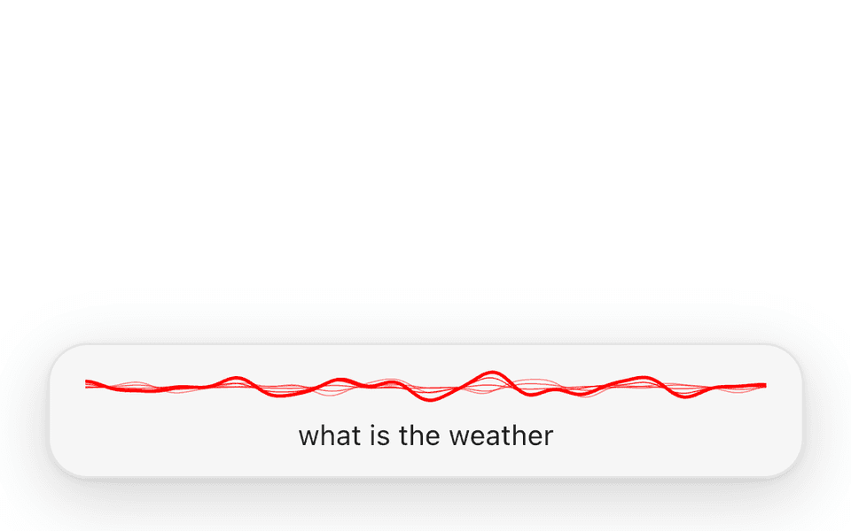
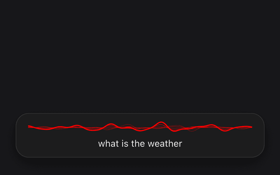
The kit never renders a listening surface on its own, so place one first inside the listensRoot element. A <listens-listening-bar /> is a full-width strip pinned to the top of the page, with the wave and the live transcript. For a compact capsule that floats over the page instead, import ListensListeningPopupComponent and render a <listens-listening-popup /> in the same place. Only the most recently mounted bar or popup shows.
app.ts
import { Component } from '@angular/core';
import { RouterOutlet } from '@angular/router';
import {
  ListensRootDirective,
  ListensListeningBarComponent,
} from '@listenssoft/speechui-angular';

@Component({
  selector: 'app-root',
  imports: [RouterOutlet, ListensRootDirective, ListensListeningBarComponent],
  template: `
    <div listensRoot>
      <listens-listening-bar />
      <router-outlet />
    </div>
  `,
})
export class App {}Light and dark mode
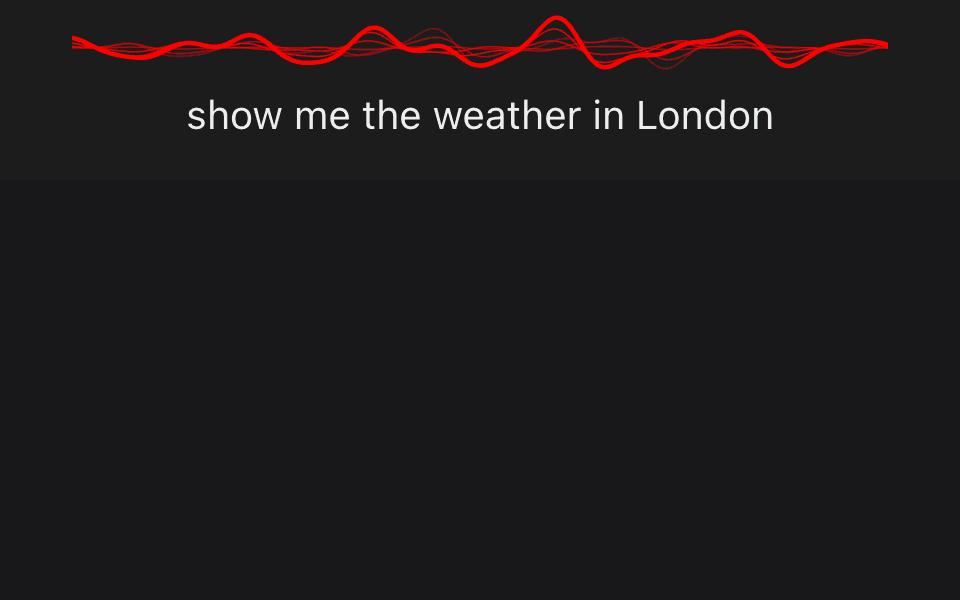
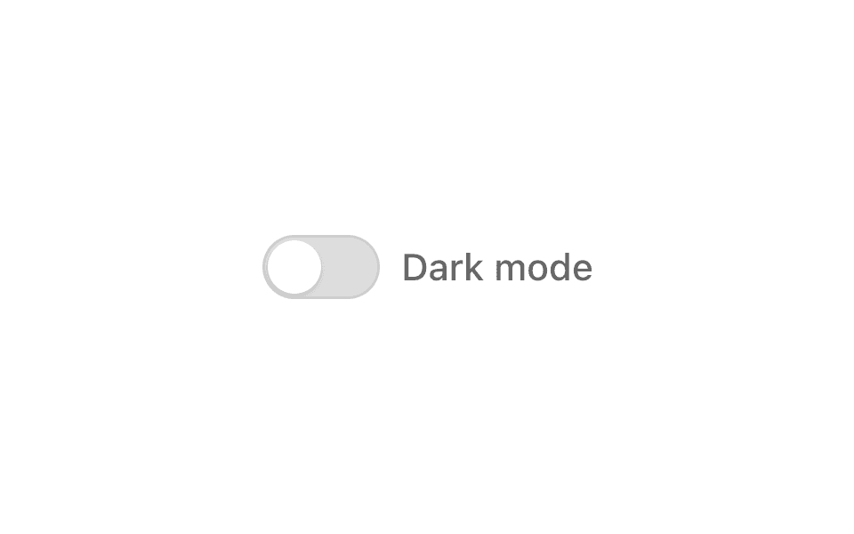
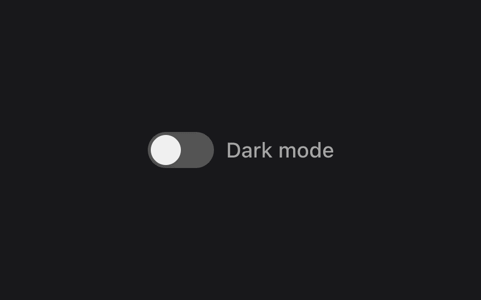
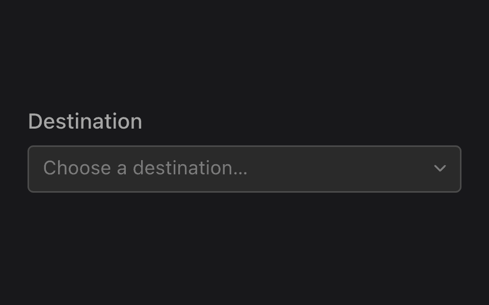
Every control, the listening bar and the popup follow the device’s light or dark setting on their own. To switch them yourself, set data-listens-theme="dark" or "light" on the <html> element, and remove it to follow the device again. This dark mode switch is a <listens-toggle>, so people can tap it or say “dark mode”. Render it anywhere inside the listensRoot element. To change the colors themselves, see Theming.
dark-mode-toggle.ts
import { Component } from '@angular/core';
import { ListensToggleComponent } from '@listenssoft/speechui-angular';

@Component({
  selector: 'app-dark-mode-toggle',
  imports: [ListensToggleComponent],
  template: `
    <listens-toggle
      label="Dark mode"
      command="dark mode"
      [checked]="dark"
      (checkedChange)="changeTheme($event)"
    />
  `,
})
export class DarkModeToggle {
  // Start from the device setting, so the switch matches what's on screen.
  dark = matchMedia('(prefers-color-scheme: dark)').matches;

  changeTheme(next: boolean) {
    this.dark = next;
    // Every SpeechUI component switches to this theme.
    document.documentElement.setAttribute(
      'data-listens-theme',
      next ? 'dark' : 'light',
    );
  }
}Components
Signature
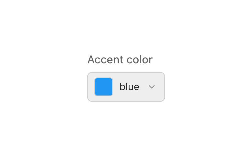
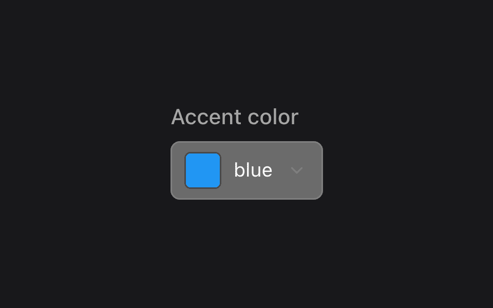
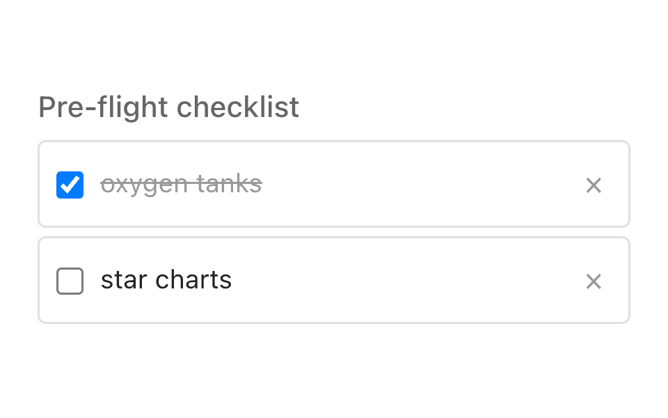
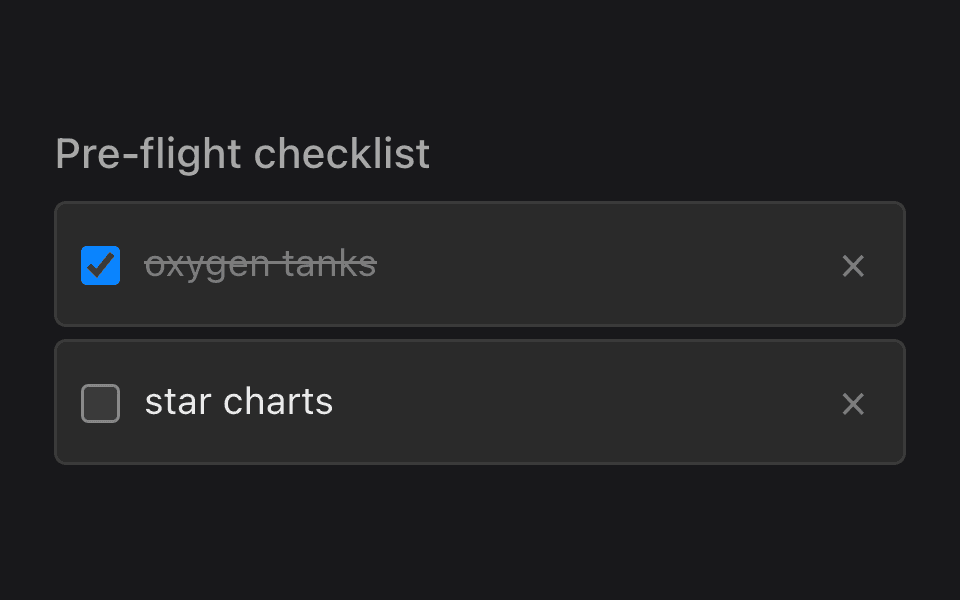
The pieces that make an app feel speech-native.
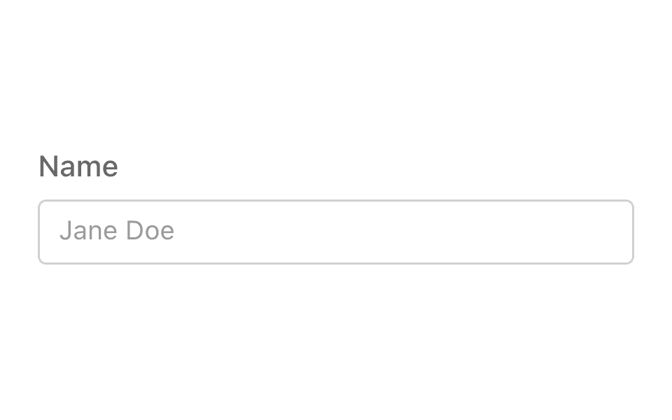
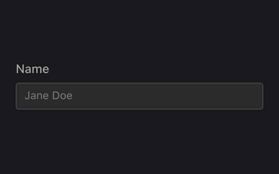
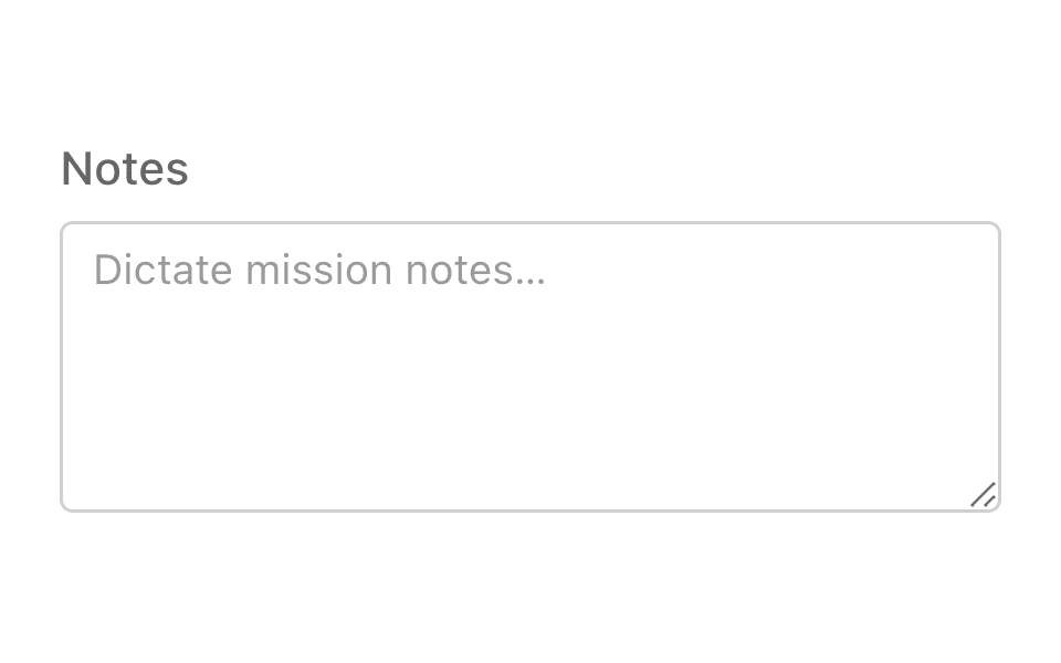
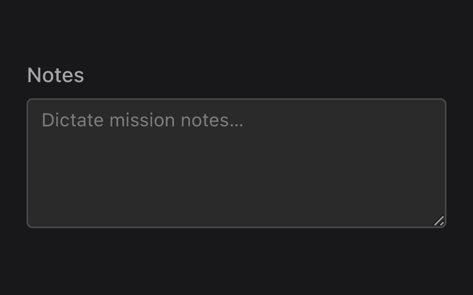
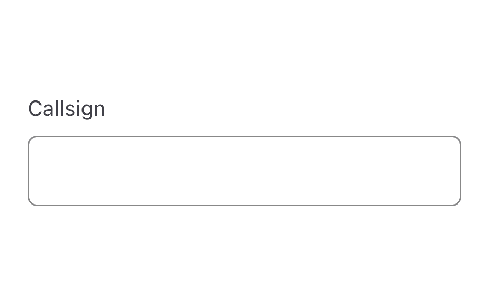
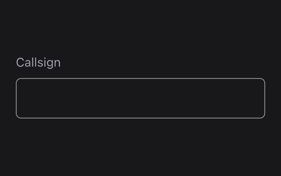
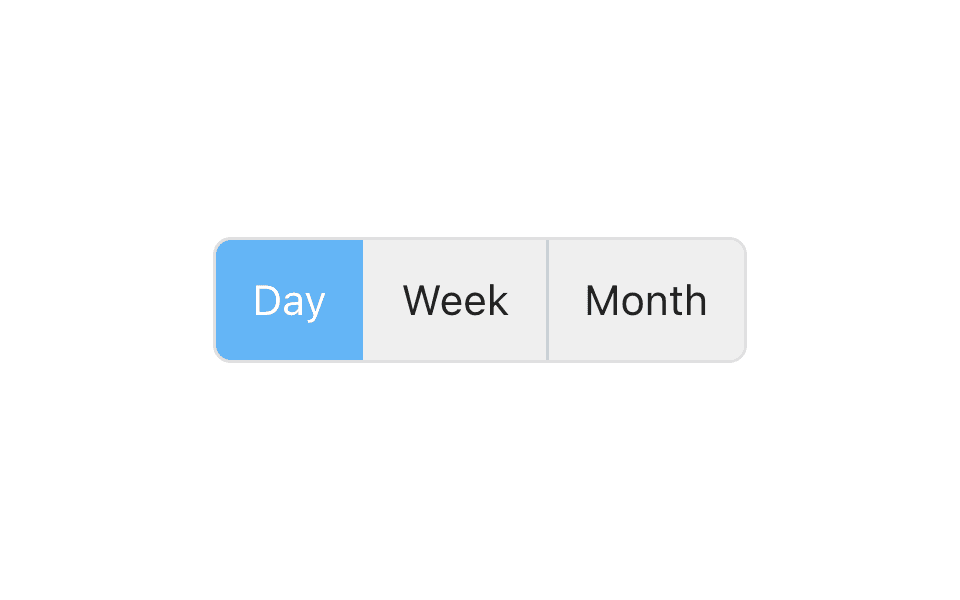
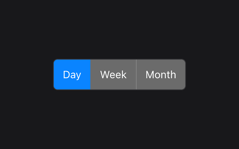
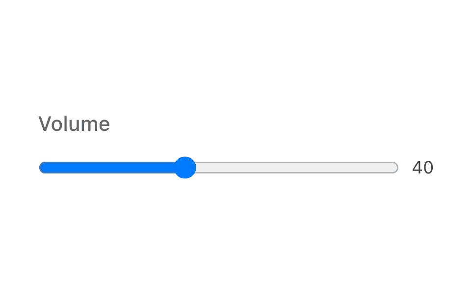
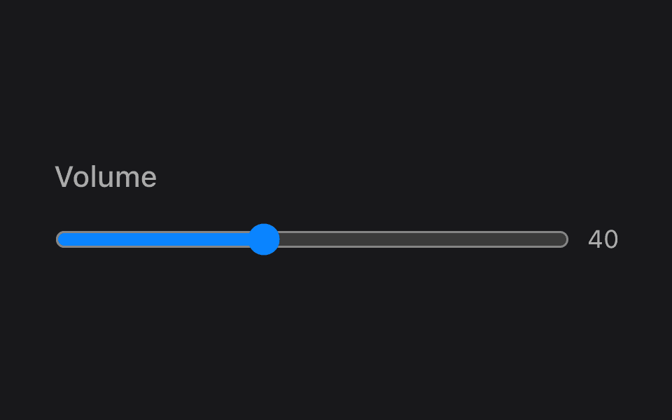
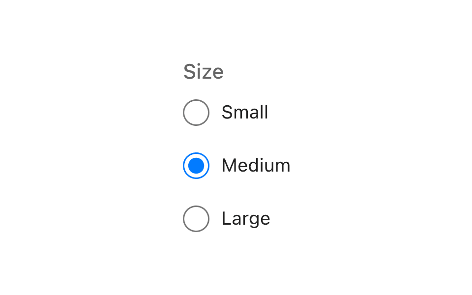
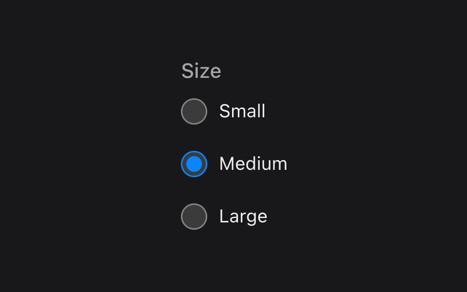
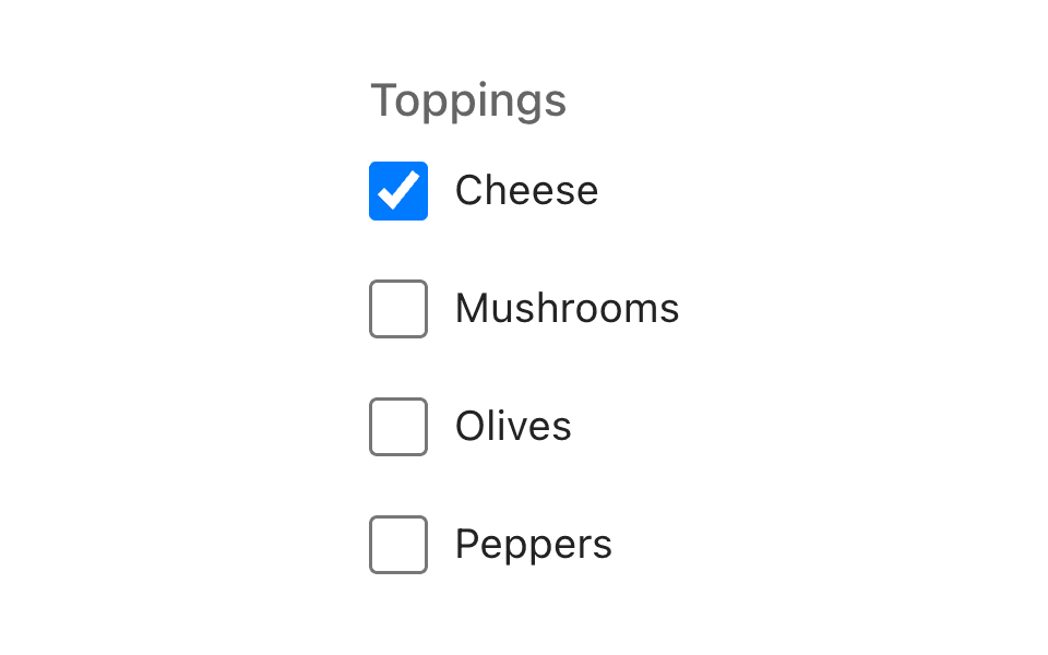
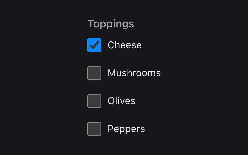
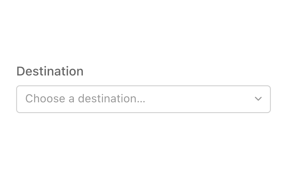
Gallery
Every control on one page, with the interaction model you can try out rather than read about.