Input (bare)
ListensInput@listenssoft/speechui-react-nativeA plain native input that takes dictation — zero kit markup, zero kit styles. Yours to design.
Same speech behavior as the text field — claim on a starts-with match, stream the remainder into the value filtered by type, contains fallback, onMatch flushed once on stop — rendered as exactly one native element with nothing added. While the mic is open the element carries data-listening.
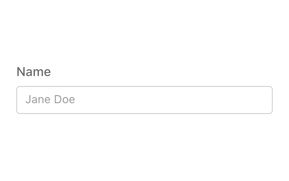
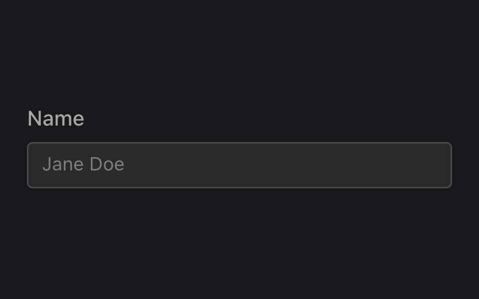
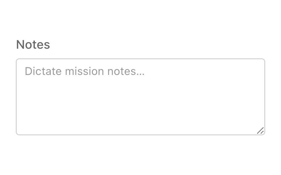
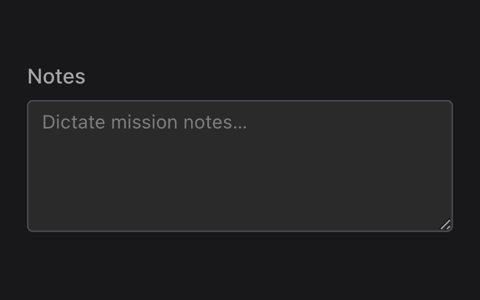
Your input, our dictation
All visible styling belongs to the sample; the kit adds only behavior.
Loading the React Native kit…
Hold anywhere and say:“callsign rocinante”“callsign apollo”
Props
- not set
- not set
React Native
Updates as you tick propsimport { ListensInput } from "@listenssoft/speechui-react-native";import { useState } from "react";
function Demo() { const [callsign, setCallsign] = useState(""); return ( <ListensInput command="callsign" label="Callsign" type="letters" value={callsign} onChangeText={setCallsign} onMatch={setCallsign} style={{ padding: 10, borderWidth: 1, borderColor: "#888", borderRadius: 6, }} /> );}What you can say
| Say | Effect |
|---|---|
| “callsign rocinante” | Starts-with match: streams “rocinante” into the value (filtered by type). |
| “the callsign is rocinante” | Contains fallback: sets the value to the words after the command (“is rocinante”) if nothing else claimed the phrase. |
See the text field for the full dictation semantics — they are identical by design.
API reference
React Native props for @listenssoft/speechui-react-native.
Props
| Prop | Type | Default | Description |
|---|---|---|---|
type | ListensTextValueType | — | Speech filter for dictated text. |
Extra props
| Prop | Type | Default | Description |
|---|---|---|---|
command | string | label | The spoken prefix that starts dictation. |
label | string | — | Contract label and command fallback. Not rendered. |
onMatch | (value: string) => void | — | Fires once when listening stops. |
…TextInputProps | TextInput props | — | value, onChangeText, placeholder, style — a plain TextInput with zero default styling. |
Styling hooks
Styling hooks
| Hook | Type | Default | Description |
|---|---|---|---|
style | StyleProp | — | The TextInput is unstyled; bring your own design system. |