SpeechUI for React Native
An UI kit with all the essentials upgraded to work with speech
Setup
Requires React Native 0.76+ (Expo SDK 52+).
npm install @listenssoft/speechui-react-native
npx expo install expo-speech-recognitionexpo-speech-recognition is the default speech backend. Add its config plugin so the app asks for microphone and speech permissions. It isn’t in Expo Go, so run the app in a development build.
app.json
{
  "expo": {
    "plugins": [
      [
        "expo-speech-recognition",
        {
          "microphonePermission": "Allow $(PRODUCT_NAME) to use the microphone for voice commands.",
          "speechRecognitionPermission": "Allow $(PRODUCT_NAME) to use speech recognition."
        }
      ]
    ]
  }
}Add ListensProvider
Wrap your root component in ListensProvider. That’s App.tsx, or app/_layout.tsx with Expo Router. Pass your license key as licenseKey. Get your license key.
App.tsx
import { ListensProvider } from '@listenssoft/speechui-react-native';

export default function App() {
  return (
    <ListensProvider licenseKey="YOUR_LICENSE_KEY">
      {/* …the rest of your app */}
    </ListensProvider>
  );
}Add a ListeningBar or ListeningPopup
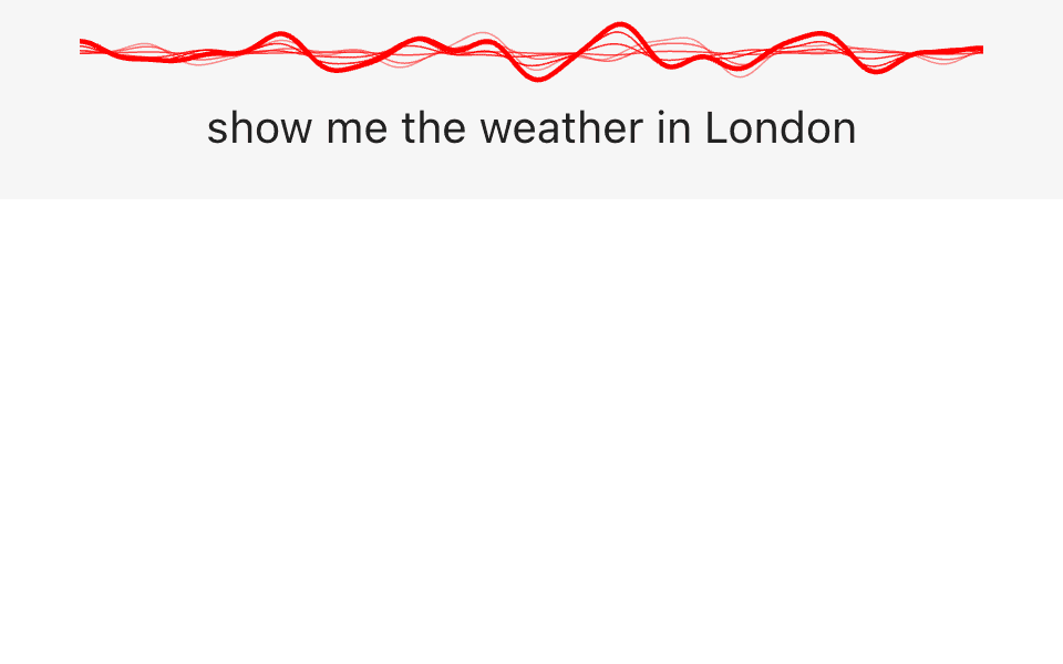
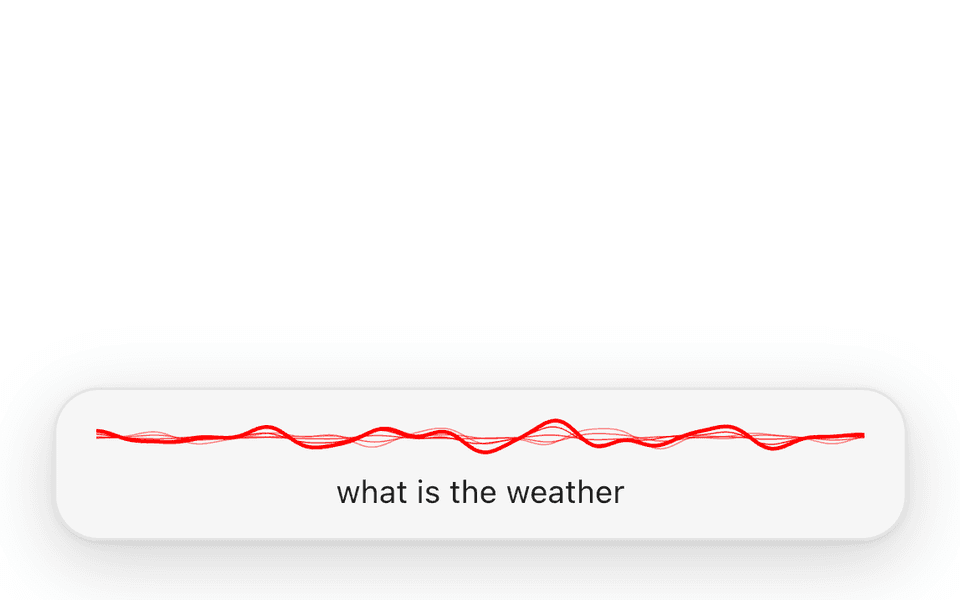
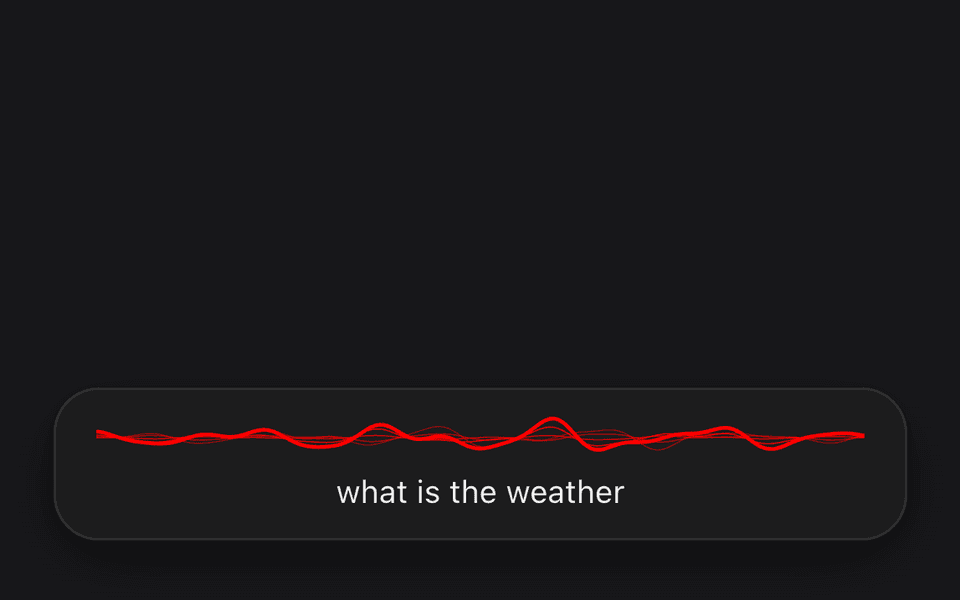
The provider never renders a listening surface, so place one first inside it. A ListeningBar sits in normal layout flow above your content, with the wave and the live transcript. For a compact capsule that floats over the screen instead, render a ListeningPopup in the same place. It’s absolutely positioned and anchors to its parent, so keep it at the root. Only the most recently mounted bar or popup shows.
App.tsx
import {
  ListensProvider,
  ListeningBar,
} from '@listenssoft/speechui-react-native';

export default function App() {
  return (
    <ListensProvider licenseKey="YOUR_LICENSE_KEY">
      <ListeningBar />
      {/* …the rest of your app */}
    </ListensProvider>
  );
}Light and dark mode
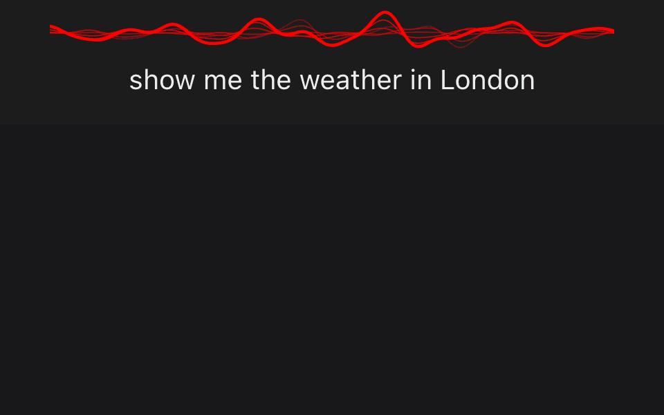
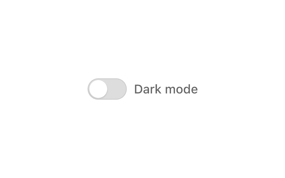
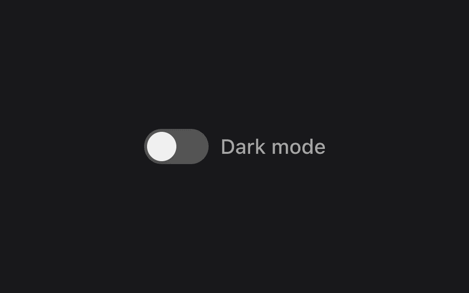
Every control, the listening bar and the popup follow the device’s light or dark setting on their own. To switch them yourself, pass LISTENS_DARK_THEME or LISTENS_LIGHT_THEME to the provider’s theme prop, and leave theme out to follow the device again. This dark mode switch is a ListensToggle, so people can tap it or say “dark mode”. To change the colors themselves, see Theming.
App.tsx
import {
  LISTENS_DARK_THEME,
  LISTENS_LIGHT_THEME,
  ListensProvider,
  ListensToggle,
  ListeningBar,
} from '@listenssoft/speechui-react-native';
import { useState } from 'react';
import { useColorScheme } from 'react-native';

export default function App() {
  // Start from the device setting, so the switch matches what's on screen.
  const scheme = useColorScheme();
  const [dark, setDark] = useState(scheme === 'dark');

  return (
    <ListensProvider
      licenseKey="YOUR_LICENSE_KEY"
      theme={dark ? LISTENS_DARK_THEME : LISTENS_LIGHT_THEME}
    >
      <ListeningBar />
      <ListensToggle
        label="Dark mode"
        command="dark mode"
        value={dark}
        onValueChange={setDark}
      />
      {/* …the rest of your app */}
    </ListensProvider>
  );
}Components
Signature
The pieces that make an app feel speech-native.
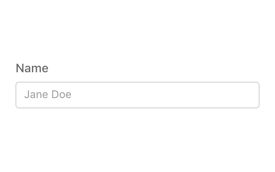
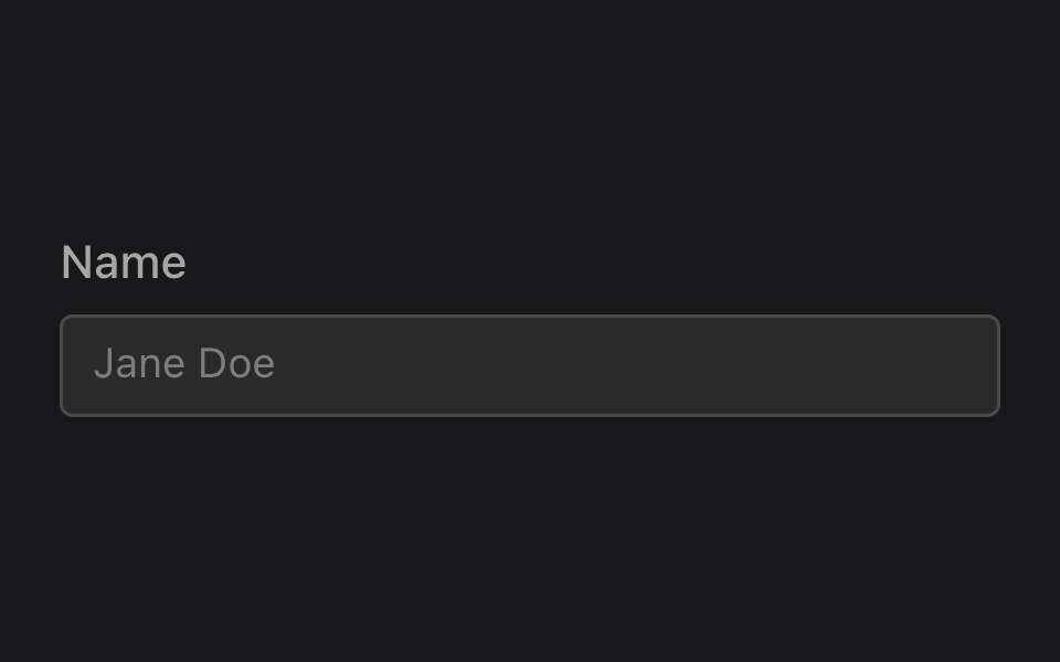
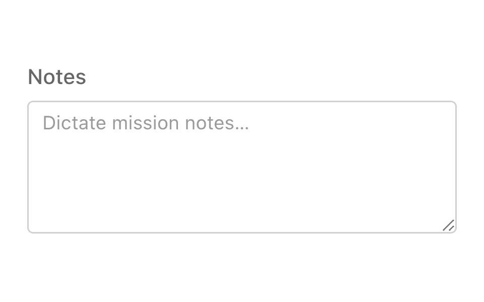
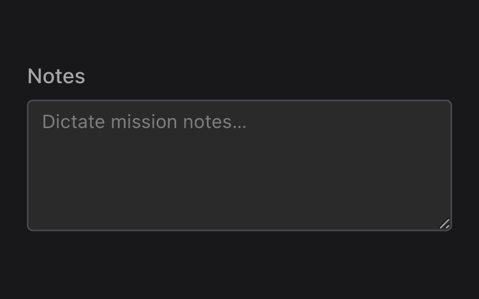
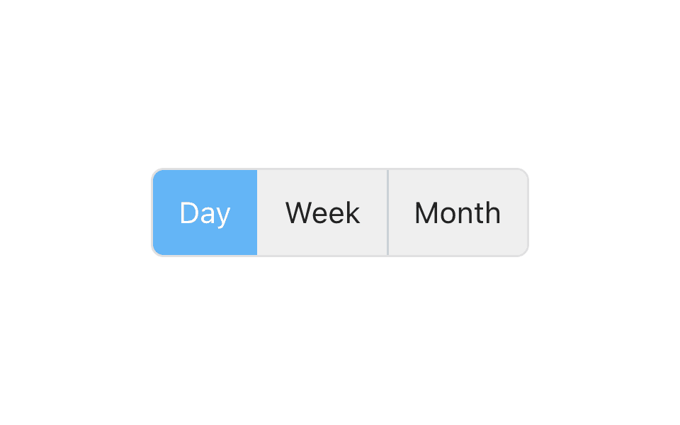
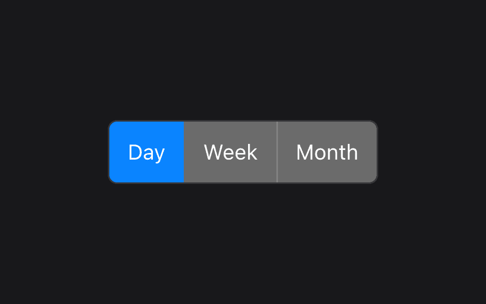
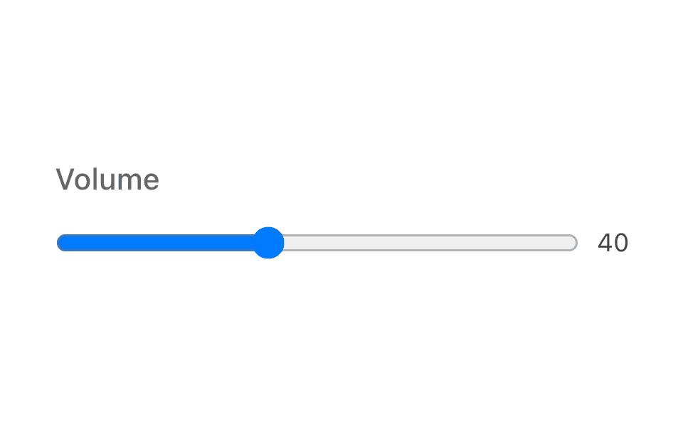
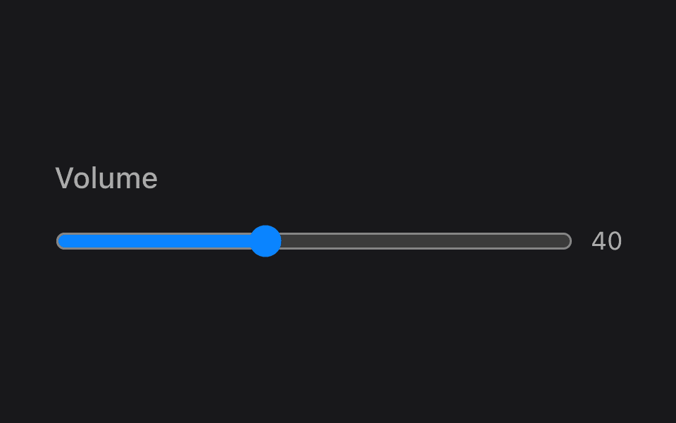
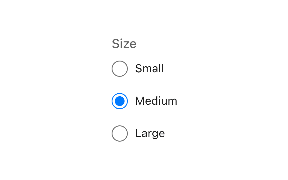
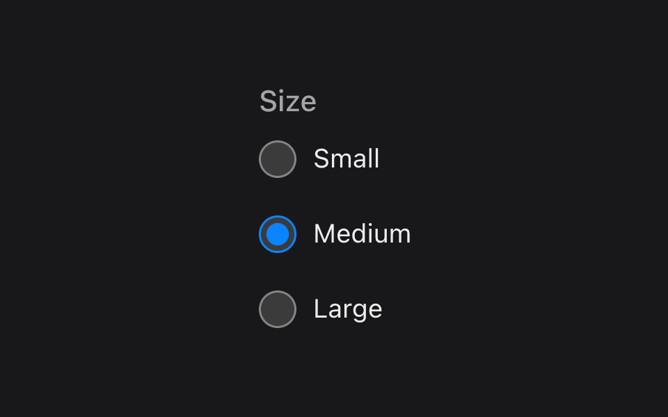
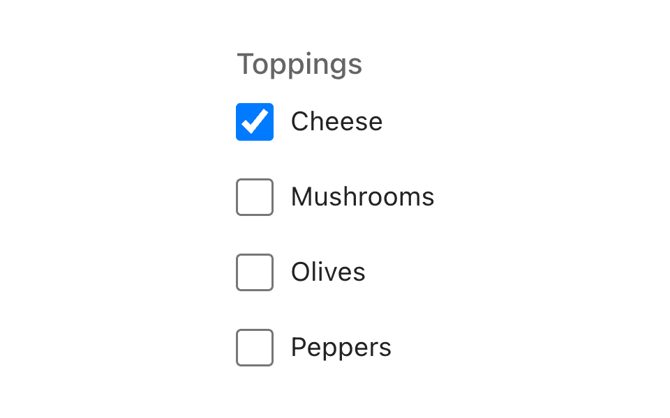
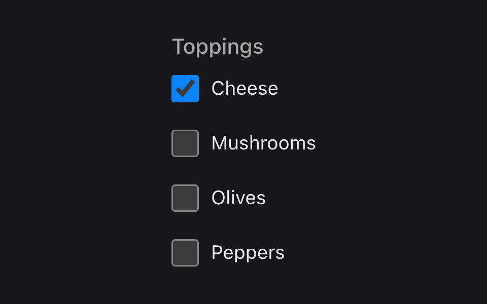
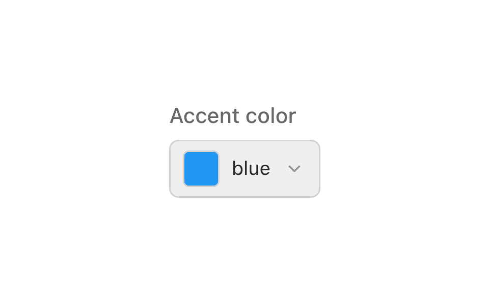
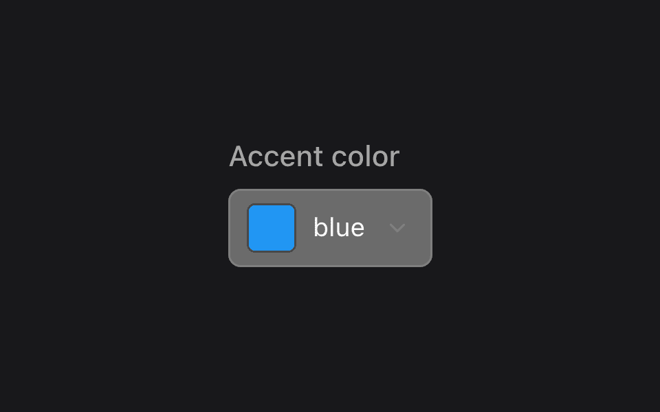
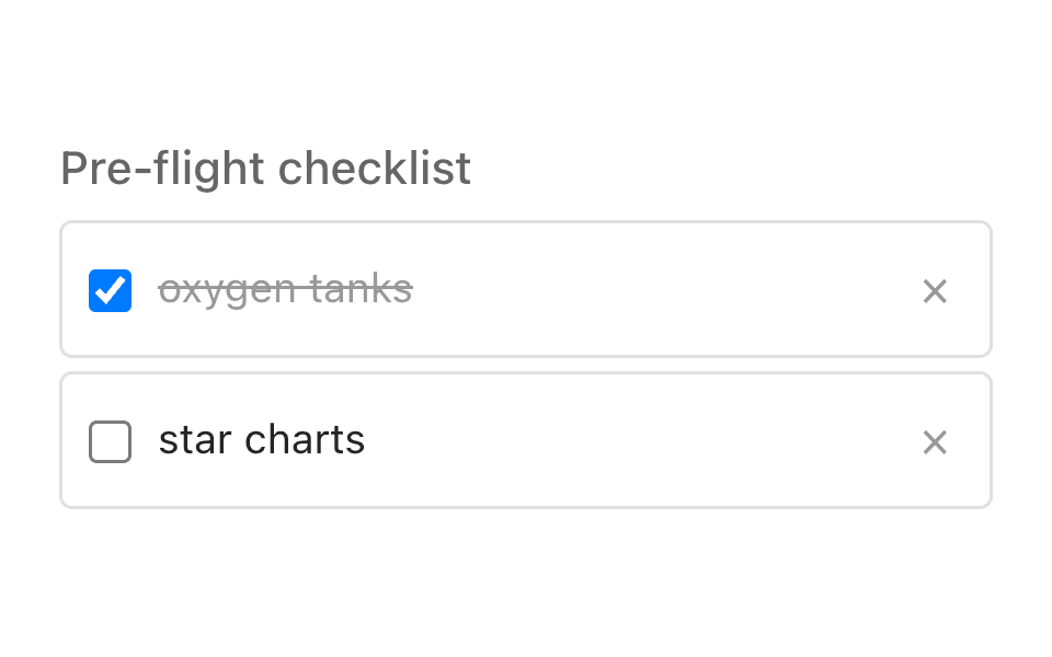
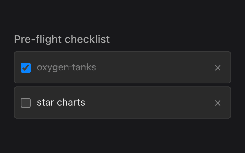
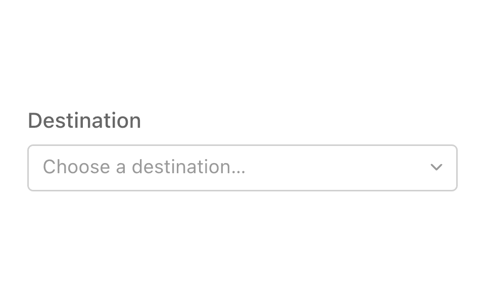
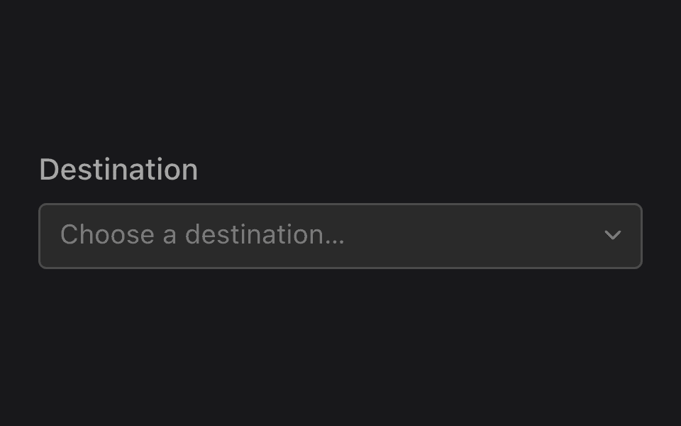
Gallery
Every control on one page, with the interaction model you can try out rather than read about.