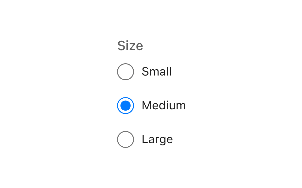
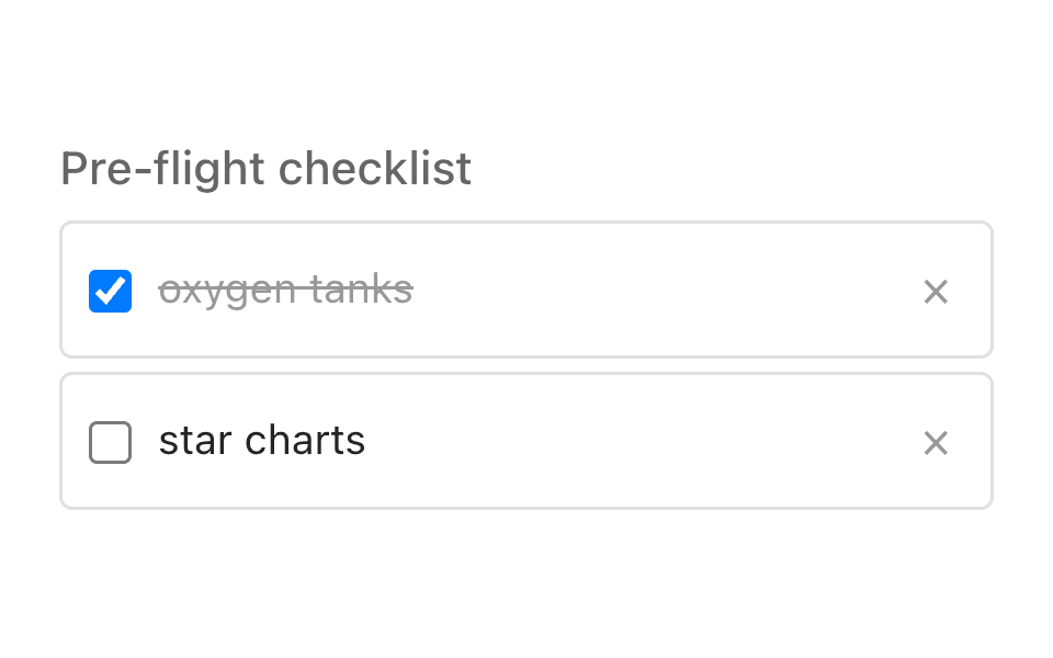
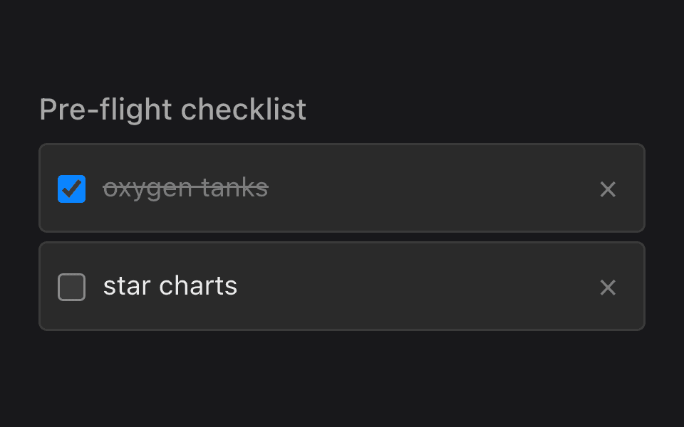
Checkbox
ListensCheckbox@listenssoft/speechui-react-nativeMulti select by voice: “toppings cheese and olives” toggles both.
A checkbox group holding a string[]. Speech toggles each option once per time it is spoken: “toppings cheese” checks Cheese; saying “cheese” again in the same breath unchecks it. Occurrence counting keeps interim recognition flutter from double-toggling.
Basic multi select
Loading the React Native kit…
Hold anywhere and say:“toppings mushrooms”“toppings cheese and olives”
Props
- not set
React Native
Updates as you tick propsimport { ListensCheckbox } from "@listenssoft/speechui-react-native";import { useState } from "react";
function Demo() { const [toppings, setToppings] = useState(["Cheese"]); return ( <ListensCheckbox label="Toppings" command="toppings" options={["Cheese", "Mushrooms", "Olives", "Peppers"]} value={toppings} onChange={setToppings} /> );}What you can say
| Say | Effect |
|---|---|
| “toppings mushrooms” | Toggles Mushrooms. |
| “toppings cheese and olives” | Toggles both — every matched option in the remainder toggles. |
| “toppings cheese … cheese” | Checks Cheese, then unchecks it: each spoken occurrence is one toggle. |
| “…add mushrooms to the toppings…” | Works too — the command may appear anywhere; everything after it is matched. |
A new utterance (after a pause) starts fresh, so repeating “toppings cheese” later toggles again. Aliases work exactly as on the radio group.
API reference
React Native props for @listenssoft/speechui-react-native.
Props
| Prop | Type | Default | Description |
|---|---|---|---|
disabled | boolean | — | Disables the options. |
Extra props
| Prop | Type | Default | Description |
|---|---|---|---|
options* | string[] | — | The options. |
command | string | label | The spoken prefix. |
label | string | — | Group label; the command fallback. |
value | string[] | — | Controlled checked values. |
onChange | (values: string[]) => void | — | Called with the next checked set. |
aliases | Record<string, string[]> | — | Spoken aliases per option value. |
style / labelStyle | StyleProp | — | Container and label overrides. |
Styling hooks
Style props and theme keys
| Hook | Type | Default | Description |
|---|---|---|---|
style / labelStyle | StyleProp | — | Direct overrides. |
theme.interactive | token | — | The checked fill color. |
Behavior notes
- All frameworks: Unlike the radio group, the checkbox matches the command anywhere in the phrase (contains), then matches everything after it.