Label button
listens-label-button@listenssoft/speechui-angularA styled button that fires when its command is heard — “launch” clicks it.
The speech path performs a real click on the underlying button, so a type="submit" button submits its form exactly as a pointer click would. While the mic is open the button can swap its content to a spoken hint via listeningContent.
Bringing your own design system? The bare button is this control with zero styling and zero markup.
Basic button
Loading the Angular kit…
Hold anywhere and say:“launch”
Props
- default command
- default false
import { Component, signal } from "@angular/core";import { ListensLabelButtonComponent } from "@listenssoft/speechui-angular";
@Component({ selector: "demo-label-button", imports: [ListensLabelButtonComponent], template: ` <div style="display: grid; gap: 8px; justify-items: start"> <listens-label-button label="Launch" command="launch" (clicked)="count.set(count() + 1)" /> <span>Launched {{ count() }} times</span> </div> `,})export class DemoLabelButton { count = signal(0);}A hint while listening
listeningContent replaces the button's content while the mic is open — the button itself tells the user what to say.
Loading the Angular kit…
Hold anywhere and say:“confirm”
import { Component, signal } from "@angular/core";import { ListensLabelButtonComponent } from "@listenssoft/speechui-angular";
@Component({ selector: "demo-label-button-listening", imports: [ListensLabelButtonComponent], template: ` <div style="display: grid; gap: 8px; justify-items: start"> <listens-label-button label="Confirm order" command="confirm" listeningContent='say “confirm”' (clicked)="last.set(now())" /> <span>Last confirmed: {{ last() }}</span> </div> `,})export class DemoLabelButtonListening { last = signal("—"); now() { return new Date().toLocaleTimeString(); }}What you can say
| Say | Effect |
|---|---|
| “launch” | Fires the button once (a real click on the underlying element). |
| “…ready to launch now…” | Also fires — matching is contains, not starts-with, unless another control claimed the phrase first. |
| “launch … (again within ~1s)” | Ignored: a per-command cooldown swallows the interim re-deliveries of one utterance. Repeating after a brief pause fires again. |
Buttons match anywhere in the phrase but respect claims: if a value control claimed the transcript with a starts-with match (say, a text field named “launch window”), the button stays quiet.
API reference
Angular inputs & outputs for @listenssoft/speechui-angular.
Inputs
| Input | Type | Default | Description |
|---|---|---|---|
listeningContent | string | command | Text shown inside the button while the mic is open. |
disabled | boolean | false | Disables the button. |
Extra inputs
| Input | Type | Default | Description |
|---|---|---|---|
label | string | "" | The button text; the spoken command fallback. |
command | string | label | The spoken command that clicks the button. |
type | "button" | "submit" | "reset" | "button" | Forwarded to the inner button; a speech match on submit submits the form. |
Outputs
| Output | Type | Default | Description |
|---|---|---|---|
clicked | MouseEvent | — | Emitted on click — real or speech-triggered (the speech path calls click() on the button). |
Styling hooks
CSS hooks
| Hook | Type | Default | Description |
|---|---|---|---|
.listens-label-button | class | — | Same classes and tokens as React. |
data-listening | attribute | — | On the host while the mic is open. |
Behavior notes
- Angular: On a native
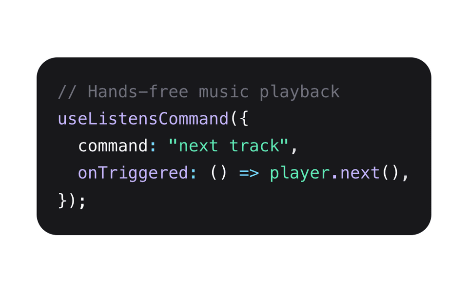
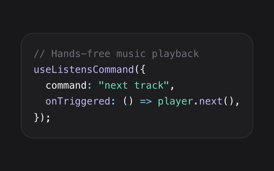
<button>you can skip the component entirely:<button listensCommand="launch">— the command directive clicks its host. See the command page.